Why are Frank Bowling’s Horizontal Paintings better than his Vertical Ones?
For me one of the outstanding artistic discoveries of the past five or so years has been the work of the octogenarian painter Frank Bowling. I first became aware of Bowling, at least as more than a name, and his work through posts on Facebook by the Engish art critic Matthew Collings. Bowling had taught Collings in art school; and it seemed as if Bowling, who long maintained studios in both London and New York City, was much more prominent in England that elsewhere. Then Bowling had a major retrospective in Germany in 2017, and the reproductions in that exhibition’s catalog gave the strong impression of a major artist. A few years ago the San Francisco Museum of Modern Art acquired Bowling’s large, horizontally formatted abstract painting ‘Elder Sun Benjamin’ (2018), a rare spirit-lifting event and subsequent oasis in the artistic desert of the Bay Area artworld. Most recently the SFMOMA hosted a large exhibition of Bowling’s works, largely from 1965-75, together with a few more recent paintings and some works by artist contemporaries and mentors who were important to Bowling. This show seemed to confirm my sense that Bowling is the greatest living abstract painter, or at least the greatest known to me. But each viewing of the show left a peculiar and puzzling impression: Why is it that Bowling’s paintings in a horizontal format, especially very large abstract works organized in a few broad bands of color, almost invariably seemed more interesting and engaging than those in a vertical format, whether abstract or containing one or more of the maps of continents that were the focus of the show?
Along with the greatly increased exhibition of Bowling’s art internationally in the past decade, there has been an accompanying efflorescence of writing on Bowling in monographs and catalog essays. The emphases of this literature are unsurprising—the issues surrounding a Black Guyanese painter finding his way in London and New York City--, while equally unsurprising (at least to me) is the near-complete neglect of Bowling’s own published writings that are not directly relevant to his ethnicity and country of origin. Bowling has repeatedly stated that an early reading of the philosopher of art Richard Wollheim’s essay ‘On Expression and Expressionism’, published in 1964, was and is the touchstone of his artistic thinking. This point is unmentioned in what seem to be the most widely read, or at least cited, pieces on Bowling, those of German retrospective’s curator Okwui Enwezor and some pieces by the cultural theorist and critic Kobena Mercer. It is likewise no surprise that no published consideration has been given to the question of (possibly) varying quality in Bowling’s work.
In a zoom lecture of 2021, ‘Expression in Contemporary Art’ I sketched an account of Bowling’s artistic practice, and suggested what roles Wollheim’s essay might have played in Bowling’s thought. That essay was the first of several major writings by Wollheim on artistic expression published over three decades. In that first attempt Wollheim was concerned to stress two negative points about expressiveness in the visual arts: First, that there is no secure, context-unspecific route from the character of a mark to the kinds of expression it embodies or evokes. This strikes at the root of a range of artistic ideologies associated with Abstract Expressionism, where for example one might be tempted to infer from an ‘agitated’ mark to an ‘agitated’ state of mind of the mark-maker. Second, that there is no context-free set of rules or norms or procedures that can reliably produce any particular kind of expressiveness: broad strokes do not necessarily evoke broad thoughts. Although Bowling is reticent in describing how he understood and appropriated Wollheim’s essay, it is irresistible to think that the first claim broke any allegiance to Abstract Expressionist ideologies, and the second rendered incredible any thought that there was one particular route towards whatever kinds of expressiveness the artist wished to achieve.
If Bowling took something like these thoughts from Wollheim’s essay, it becomes intelligible how he might wish to continue to use both vertical and horizontal formats: neither format carries any determinate kind of expressiveness, and the sustained searching quality of Bowling’s oeuvre, the never-satisfied search for yet more materials that bear the sense of fecundity and possibilities of transformation is is a constant in Bowling’s work across the past half century. But this only intensifies the problem: what of my impression of the consistently richer and more successful expressiveness in Bowling’s abstract paintings of the horizontal format? To help make sense of this, I’ll consider two works c. 1970 in the exhibition: the vertically formatted ‘Night Journey’ (1969-70), a chromatically rich acrylic containing maps of Africa and Central and South America; and the horiztonal ‘Looking at Barney & Mark’ (1972), a large painting of roughly three horizontal bands, the lowest an orange-red then topped by two chromatically similar blue bands, and evoking something of a landscape, especially as the two blue bands are separated by a relatively narrow cloud-like band of dull whites and greys.

‘Night Journey’ is the more immediately appealing of the two, as it offers a spectacular though wholly instance of Bowling’s way with primary and secondary colors. The canvas is largely stained with an atmospheric wash of dark reds, which burst in the upper left into a brilliant pinkish red, like the crown of a cumulus cloud irradiated by a setting sun. Bowling has lain a vertical swath of blue on the right side, which obscures some of the red underlayment while repeating in a more confined and restrained way the drama of red. The left side shows the map of Central and South America, dark and partially haloed with an aureole of grayish-blue. The right side displays the map of Africa, likewise dark but an overlay of blue and a horizontal deposit of red pigment rendered as if blown through a small tube. But the key structural element, one that makes it natural to speak individually of the painting’s left and right sides, is a rough vertical plane of yellow, seeming to emerge from a pale greenish ground, and again exhibiting something of the red’s and blue’s efflorescence into pure color. What more could one want?
The description so far ignores a feature that is invisible in reproduction, but massively determining in actuality: I mean scale. It is not enough to be told that Bowling’s works are large—‘Night Journey’ is roughly 7 feet by 6 feet. It is perhaps irresistible but too easy to characterize this as ‘monumental’, for what is the vertical format roughly bisected, and so invoking relations of symmetry, metaphorizes is the surely the human body. Despite the size, the painting seems instantly grasped as a gestalt, and something with clear, impermeable boundaries, bilateral symmetry, and a dynamic, internally differentiated richness. One of Bowling’s basic painterly mechanisms is echoing the edge’s of the canvas with narrow bands, in many cases with colors and markings that seem alien to the styles and rhythms of much of the canvas. In ‘Night Journey’ the bands of red along the bottom edge, differentiated left and right as light to dark, seem to have been spilled up against and so are contained by the edge of the canvas; they serve only to reinforce the sense of the surface’s rigid boundedness.
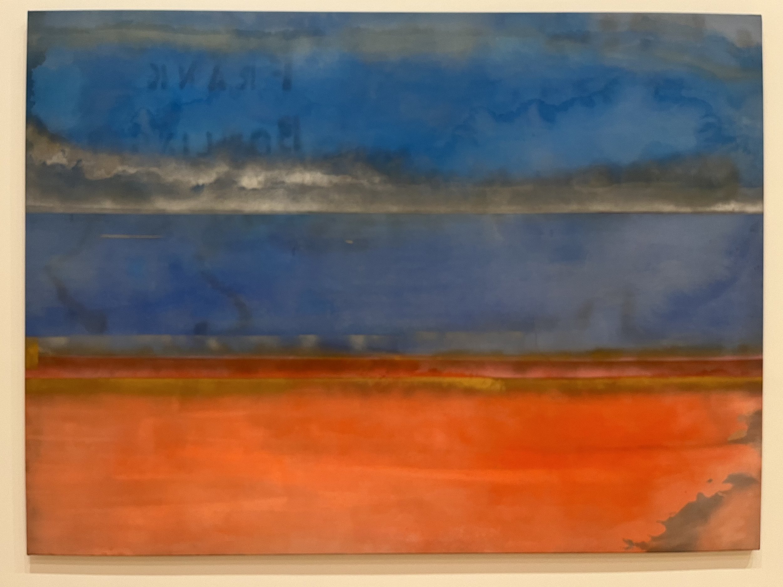
Contrast these effects with those of ‘Looking at Barney & Mark’. Keeping the upper two bands closely similar induces the operation of what seems to me Bowling’s most basic artistic mechanism, the play of boundaries in a relatively unbounded field. So here one looks and reflects and looks: Are there two or three bands? Does the lower red band ‘balance’ the upper two? Are the upper two bands abstractions of the sky, or is it sky and water? Is the lower band a thing of warmth from the smudged iciness of the sky, or is it something rather scalding whose effects are relieved by the cooler blues? And on and on. Bowling here eschews the somewhat forced drama of ‘Night Journey’’s efflorescences in favor of the more closely valued continuity and mild contrast between the relatively, but only relatively, darker blue of the middle band and the lighter blue of the upper. Then consider the edges: the long horizontal format (roughly 5.5 by 9.5 feet) makes it impossible to keep the painting as a whole in sight from any normal viewing distance, and so the sense in the vertical formats of a bounded gestalt does not arise. At the bottom right corner, some of the upper bands’ blue has stained a triangular pool that seems to extend far beyond the physical edge of the canvas. Searching for elements that rhyme with this play of edging, one notices that the middle blue flows to the edge, while the lighter upper blue seems to be in the process of being repelled and collecting itself into a more bounded pool or cloud. Perhaps the upper band is more a whitish-grey solid cloud across which a blue pool drifts? And finally there’s the non-pictorial element of Bowling’s stenciled name in the upper left, reversed as if to indicate the play of order and perhaps to insinuate a mechanism of the bands attached to horizontal, so-called ‘piano’ hinges, as if the canvas could be folded in and out. The maker names himself, and plays with his name as with the painting’s broad structural elements.
In his Mellon lectures on abstract art, published as Paths to the Absolute, the art historian John Golding notes two striking features shared by major 20th century artists including Mondrian, Malevich, and Kandinsky. Where such artists begin as figurative painters and move to abstraction, one can see across their artistic trajectory that their abstract works emerge as if from the imagined viewpoint of the artist-viewer of their figurative works having ‘moved up’ (Golding, p. 14) to a figurative work until the pictorial elements carrying the recognizability of the figure lose their role in representation, and gain heightened non-semantic qualities of rhythm, color, and texture. Golding further notes that such artists begin with either portrayals of human figures or of landscapes, and not still-lifes (pp. 19-20). Golding suggests that still-life didn’t carry a charge of symbolic meanings and resonances transferred into the resulting abstract paintings sufficient to sustain aesthetic interest. Bowling was never strictly a figurative painter nor a landscape painter; his early work was rather collage-like in combining both figurative and abstract elements. This earlier work thereby insists on a relatively heightened temporality of looking, as the viewer considers part-to-part relations grouped through small-scale projections. If something like the contrast I’ve drawn between Bowling’s later vertical and horizontal formats is right, then the former might be thought to inherit the symbolism and the resonances of figurative portrayal, and the latter of landscape. But only the latter, the abstracts plainly evoking landscapes, carry over Bowling’s concern with the duration of looking populated by framing and re-framing. Likewise these artistic mechanisms more distinctive of the horizontal than the vertical format seem more of a piece with the negative directives Bowling would have drawn from Wollheim’s essay, directives which incorporated into Bowling’s theory of his artistic practice would have charged him with the task of introducing order and hierarchy while simultaneously maintaining the constant sense of their reversibility and undoing.
So if something like these suggestions and interpretive points are right, then the general superiority of Bowling’s horizontal paintings is intelligible, indeed predictable, as they give fuller play to Bowling’s imagination and interests, and the artistic mechanisms that articulate them.
References:
Okwui Enwezor and others, Frank Bowling: Mappa Mundi (2017)
John Golding, Paths to the Absolute (2000)
Mel Gooding, Frank Bowling (2021)
Kobena Mercer, ‘Atlantic Errancy’ in Frank Bowling’s Americas: New York, 1966-75 (2022), Reto Thüring and Akili Tommasino with Debra Lennard
John Rapko, ‘Expression in Contemporary Art’ (2021), pdf of images on academia.edu
Richard Wollheim, ‘On Expression and Expressionism’ (1964)